 10 分钟上手 matplotlib
# 1. 简单的画图程序:以折线图为例
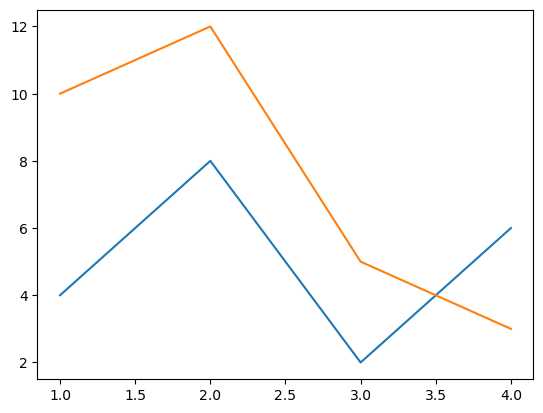
# 1.1 一个最简单的示例
- 分别用
plt.plot画出两条折线
import matplotlib.pyplot as plt

# 数据
seasons = [1, 2, 3, 4]
stock1 = [4, 8, 2, 6]
stock2 = [10, 12, 5, 3]

# 画两条折线
plt.plot(seasons, stock1)
plt.plot(seasons, stock2)
plt.show()
1
2
3
4
5
6
7
8
9
10
11
2
3
4
5
6
7
8
9
10
11
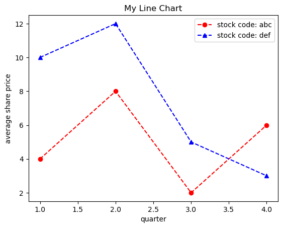
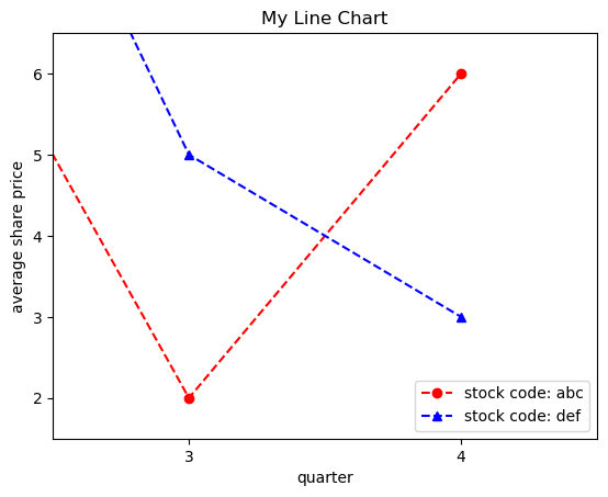
# 1.2 改线型、给折线加上图例
现在对 1.1 示例进行简单的改进:
- 在
plt.plot时,增加线型的参数 - 借助于
xlabel和ylabel方法来增加横纵坐标周的标注 - 使用
title方法来添加标题 - 使用
plt.legend()添加可视化图例,这需要在plt.plot中同时制定每条线的 label
# 改进1: 指定折线图格式
plt.plot(seasons, stock1, "ro--", label="stock code: abc")
plt.plot(seasons, stock2, "b^--", label="stock code: def")
# 线型参数:'[marker][line][color]'

# 改进2: 添加标题,横纵坐标轴标注,图标
plt.title("My Line Chart") # 添加标题
plt.xlabel("quarter") # 标注 x 轴
plt.ylabel("average share price") # 标注 y 轴
plt.legend() # 添加图例(查找每条线的 label)
plt.show()
1
2
3
4
5
6
7
8
9
10
11
2
3
4
5
6
7
8
9
10
11
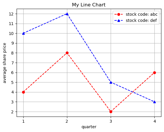
# 1.3 调整刻度/添加网格
- 通过
xticks和yticks设置坐标刻度 - 通过
plt.grid()添加辅助线网格
# 在此前的基础上
# 设置 x/y 坐标刻度
plt.xticks([1, 2, 3, 4])
plt.yticks(np.arange(2, 13, 1))
# 添加辅助线网格
plt.grid()
plt.show()
1
2
3
4
5
6
7
2
3
4
5
6
7
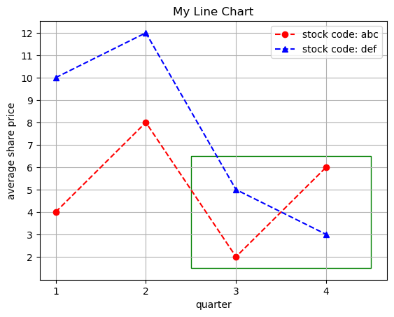
# 1.4 添加“长方块”来突出某一部分
# 改进3: 添加一个绿色方块强调两个股票的股价在第4季度反转
import matplotlib.patches as patches

# 创建一个长方体对象
rect = patches.Rectangle((2.5, 1.5), 2, 5,
                         linewidth=1, edgecolor='g',
                         facecolor='none')
plt.plot(seasons, stock1, "ro--", label="stock code: abc")
plt.plot(seasons, stock2, "b^--", label="stock code: def")
plt.title("My Line Chart")
plt.xlabel("quarter")
plt.ylabel("average share price")

# 添加长方体
plt.gca().add_patch(rect)

plt.legend()
plt.xticks([1, 2, 3, 4])
plt.yticks(np.arange(2, 13, 1))
plt.grid()
plt.show()
1
2
3
4
5
6
7
8
9
10
11
12
13
14
15
16
17
18
19
20
21
2
3
4
5
6
7
8
9
10
11
12
13
14
15
16
17
18
19
20
21
# 1.5 缩放图片,只绘制局部部分
- 使用
plt.xlim()和plt.ylim()来改变作图范围,只绘制刚刚需要突出的绿方框部分
# 改进: 改变时间轴的现实范围至上一张图片的绿色框中
plt.plot(seasons, stock1, "ro--", label="stock code: abc")
plt.plot(seasons, stock2, "b^--", label="stock code: def")
plt.title("My Line Chart")
plt.xlabel("quarter")
plt.ylabel("average share price")
plt.legend()

plt.xticks([1, 2, 3, 4])
plt.yticks(np.arange(2, 13, 1))
# 调整显示的范围
plt.xlim(2.5, 4.5)
plt.ylim(1.5, 6.5)
plt.show()
1
2
3
4
5
6
7
8
9
10
11
12
13
14
2
3
4
5
6
7
8
9
10
11
12
13
14
# 1.6 pyplot.plot() 中的格式 format
下图呈现了多种 format:
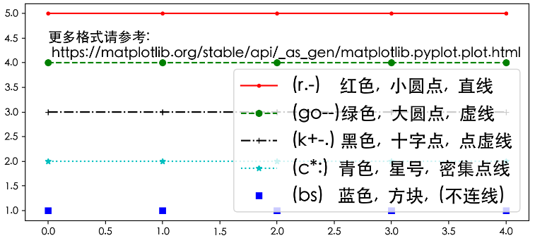
- 格式:点符号 + 颜色 + 连线符号,上图展示了一些经典的组合
- 在“连线符号”中,一个
-表示直线,两个组成的--表示虚线
- 在“连线符号”中,一个
上图的绘图代码
plt.figure(figsize=(9,4))
plt.plot(list(range(5)), [5]*5, 'r.-', label="(r.-)\t\t\t 红色,\t 小圆点,\t 直线")
plt.plot(list(range(5)), [4]*5, 'go--', label="(go--)绿色,\t 大圆点,\t 虚线")
plt.plot(list(range(5)), [3]*5, 'k+-.', label="(k+-.) 黑色,\t 十字点,\t 点虚线")
plt.plot(list(range(5)), [2]*5, 'c*:', label="(c*:)\t\t青色,\t 星号,\t 密集点线")
plt.plot(list(range(5)), [1]*5, 'bs', label="(bs)\t\t 蓝色,\t 方块,\t (不连线)")
plt.annotate("Learn More:\n https://matplotlib.org/stable/api/_as_gen/matplotlib.pyplot.plot.html",
            xy=(0.0, 4.1), fontsize=14)
plt.legend(loc='lower right', prop={'size': 18}) # bbox_to_anchor=(1, -0.1)

plt.show()
1
2
3
4
5
6
7
8
9
10
11
2
3
4
5
6
7
8
9
10
11
# 1.7 More Plot types
更多可见官网介绍:Plot types (opens new window)
现在我们已经知道了用 pyplot 画图的一些基本方法。
# 2. 画图层次
# 2.1 单个图像的构成(三层分类)
- Axis:指单个数轴
- Axes:指坐标系(例如:二维图像由两个 Axis 构成)
- Figure:指整个画面(可以包含多个坐标系 Axes)
- Artist:每个在画面中可以看到的东西(数轴/图示/边框/每条线…)都是一个 Artist,也就是一个画画的元素
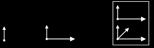
- 上图,从左到右依次是:Axis、Axes、Figure
所有这些 Artist 从小的元素到大的坐标系,都有一个分级体系,不同层次构成了树状结构:
特别看一下 Axes 对比 Figure:
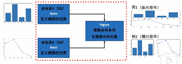
- 如上图所示,一个 Figure 可以包含多个 axes,这也构成了一个 matplotlib,其实这也是 MATLAB 中图像的一个层次观念。
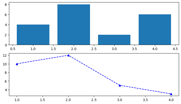
# 2.2 画多个图:使用类似 MATLAB 的语法
# MATLAB 语法
# 首先用 plt.figure 创建一个 Figure
# figsize=(9, 3) 说明横向长度是 9 英寸(inch),纵向长度为 5 英寸
plt.figure(figsize=(9, 5))

# subplot(211) 表示 2 行 1 列,画第一个图
plt.subplot(211)
plt.bar(seasons, stock1)

# 2 行 1,画第二个图
plt.subplot(212)
plt.plot(seasons, stock2, "b^--")
plt.show()
1
2
3
4
5
6
7
8
9
10
11
12
13
2
3
4
5
6
7
8
9
10
11
12
13
- 注意
plt.subplot(211)表示小图的分布式两行一列,现在开始画第一个图
绘制结果:
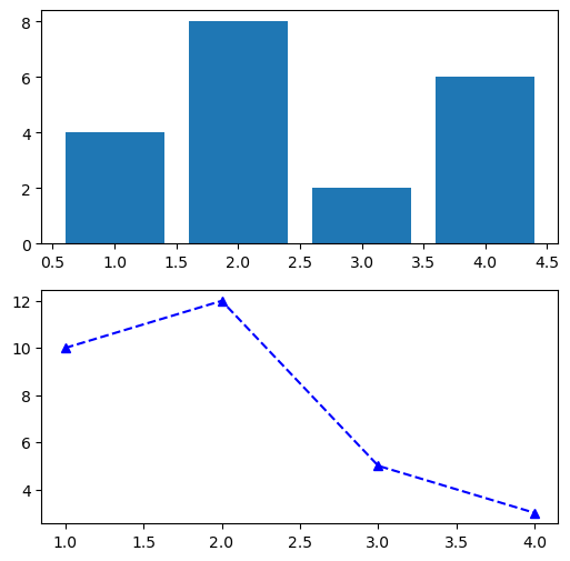
# 2.3 画多个图:基于坐标系对象(Axes)的语法
# 2.3.1 画两个 Axes
# 面向对象的 OOP 精确语法,现在每一个 Artist 都是一个 py 的对象了
fig, axes = plt.subplots(2, 1,
                         figsize=(6, 6))
axes[0].bar(seasons, stock1)
axes[1].plot(seasons, stock2, "b^--")
plt.show()
1
2
3
4
5
6
2
3
4
5
6
- 使用
plt.subplots创建了一个 Figure,同时指定参数2, 1创建了两行一列的 Axes axes对象:两个坐标系 Axes 构成的 numpy 数组,相比于之前的方式,代码更加精确
绘图如下:
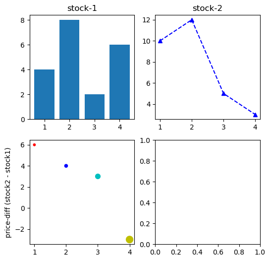
# 2.3.2 画四个 Axes
给 plt.subplots() 传入参数 2, 2 可以绘制 2 × 2 的 Axes,这个时候对 axes 对象的定位需要使用两个索引,即二维索引来定位。
# 数据
seasons = np.array([1, 2, 3, 4])
stock1 = np.array([4, 8, 2, 6])
stock2 = np.array([10, 12, 5, 3])

fig, axes = plt.subplots(2, 2, figsize=(6, 6))
axes[0, 0].bar(seasons, stock1)
axes[0, 1].plot(seasons, stock2, "b^--")
ax = axes[1, 0]
ax.scatter(seasons, stock2 - stock1,
           s=[10, 20, 50, 100],     # size,大小
           c=['r', 'b', 'c', 'y'])  # color,颜色
axes[0, 0].set_title("stock-1")
axes[0, 1].set_title("stock-2")
ax.set_ylabel("price-diff (stock2 - stock1)")
plt.show()
1
2
3
4
5
6
7
8
9
10
11
12
13
14
15
16
2
3
4
5
6
7
8
9
10
11
12
13
14
15
16
axes[0, 1]就代表第 1 行的第二列的子图
绘制如下:
但在上图中,我们没有用到第四个子图,所以接下来我们把这个 axes 删掉。
# 2.3.3 删掉某个 axes
- 可以通过
axes[1, 1].remove()删除掉第四个坐标系 - 对
fig调用相关方法可以修改 Figure 级别的相关信息
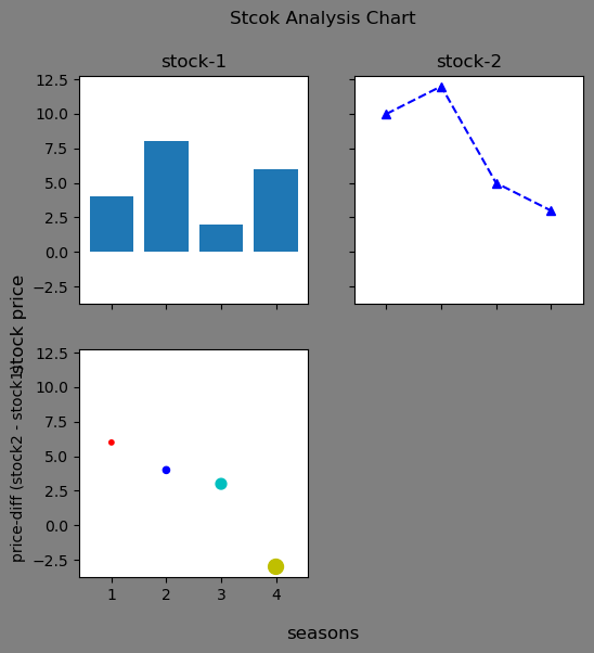
# Figure 控制 x/y 轴数值相等,背景为灰色
fig, axes = plt.subplots(2, 2, figsize=(6, 6),
                         facecolor="grey",  # 修改背景颜色
                         sharex=True, sharey=True)

# 删除最后一个坐标系
axes[1, 1].remove()

# 中间的这些代码不变
axes[0, 0].bar(seasons, stock1)
axes[0, 1].plot(seasons, stock2, "b^--")
ax = axes[1, 0]
ax.scatter(seasons, stock2 - stock1,
           s=[10, 20, 50, 100],
           c=['r', 'b', 'c', 'y'])
axes[0, 0].set_title("stock-1")
axes[0, 1].set_title("stock-2")
ax.set_ylabel("price-diff (stock2 - stock1)")

# Figure 对象添加整体大标题/注释
fig.suptitle("Stcok Analysis Chart")
fig.supylabel("stock price")
fig.supxlabel("seasons")

plt.show()
1
2
3
4
5
6
7
8
9
10
11
12
13
14
15
16
17
18
19
20
21
22
23
24
25
2
3
4
5
6
7
8
9
10
11
12
13
14
15
16
17
18
19
20
21
22
23
24
25
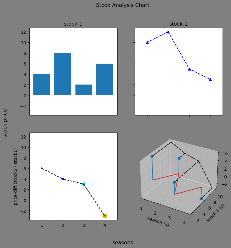
# 2.3.4 添加第四个 3D 图
其实所谓的 3D 图就是三个坐标轴组成的坐标系,x 轴是之前的时间信息,y 轴是 stock 1 的信息,z 轴是两个 stock 的差价,代码如下:
fig, axes = plt.subplots(2, 2, figsize=(8, 8),
                         facecolor="grey",  # 修改背景颜色
                         sharex=True, sharey=True)
# 绘制上面的两个坐标系
axes[0, 0].bar(seasons, stock1)
axes[0, 1].plot(seasons, stock2, "b^--")
axes[0, 0].set_title("stock-1")
axes[0, 1].set_title("stock-2")

# 绘制 axes[1, 0]
ax = axes[1, 0]
ax.scatter(seasons, stock2 - stock1,
           s=[10, 20, 50, 100],
           c=['r', 'b', 'c', 'y'])
ax.plot(seasons, stock2 - stock1, "--", color="black")
ax.set_ylabel("price-diff (stock2 - stock1)")

# 设置 figure 级别的信息
fig.suptitle("Stcok Analysis Chart")
fig.supylabel("stock price")
fig.supxlabel("seasons")

# 删除右下角的坐标系
axes[1, 1].remove()
# 重新添加右下角坐标系(改变为三维坐标系)
ax = fig.add_subplot(2, 2, 4,
                     projection='3d', facecolor='grey')
ax.stem(seasons, stock1, stock2 - stock1)  # 使用 stem 创建茎图
ax.stem(seasons, stock1, stock2 - stock1,
        linefmt='k--', basefmt='k--',
        bottom=10, orientation='y')
ax.set_xlabel('season (x)')
ax.set_ylabel('stock-1 (y)')
ax.set_zlabel('price-diff (z)')

plt.show()
1
2
3
4
5
6
7
8
9
10
11
12
13
14
15
16
17
18
19
20
21
22
23
24
25
26
27
28
29
30
31
32
33
34
35
36
2
3
4
5
6
7
8
9
10
11
12
13
14
15
16
17
18
19
20
21
22
23
24
25
26
27
28
29
30
31
32
33
34
35
36
在绘制出图片后,我们要时时对它进行优化,比如这里可以将第一个子图和最后一个 3D 图呼应一下:
fig, axes = plt.subplots(2, 2, figsize=(8, 8),
                         facecolor="grey",
                         sharex=True, sharey=True)
# 绘制上面的两个坐标系
axes[0, 0].bar(seasons, stock1)
axes[0, 0].plot(seasons, stock1, 'r+-')  # 在柱状图上在绘制一个折线图
axes[0, 0].set_facecolor('red')     # 背景设为红色
axes[0, 0].patch.set_alpha(0.2)     # 背景颜色透明度
axes[0, 1].plot(seasons, stock2, "b^--")
axes[0, 0].set_title("stock-1")
axes[0, 1].set_title("stock-2")

# 绘制 axes[1, 0]
ax = axes[1, 0]
ax.scatter(seasons, stock2 - stock1,
           s=[10, 20, 50, 100],
           c=['r', 'b', 'c', 'y'])
ax.plot(seasons, stock2 - stock1, "--", color="black")
ax.set_ylabel("price-diff (stock2 - stock1)")

# 设置 figure 级别的信息
fig.suptitle("Stcok Analysis Chart")
fig.supylabel("stock price")
fig.supxlabel("seasons")

# 删除右下角的坐标系
axes[1, 1].remove()
# 重新添加右下角坐标系(改变为三维坐标系)
ax = fig.add_subplot(2, 2, 4,
                     projection='3d', facecolor='grey')
ax.stem(seasons, stock1, stock2 - stock1)
ax.stem(seasons, stock1, stock2 - stock1,
        linefmt='k--', basefmt='k--',
        bottom=10, orientation='y')
ax.plot_surface(np.array([1,1,4,4]).reshape(2,2),
                np.array([2.5,10,2.5,10]).reshape(2,2),
                np.array([0]*4).reshape(2,2),
                alpha=0.2, color='red')
ax.set_xlabel('season (x)')
ax.set_ylabel('stock-1 (y)')
ax.set_zlabel('price-diff (z)')

# 保持“内容紧凑”
plt.tight_layout()
plt.show()
1
2
3
4
5
6
7
8
9
10
11
12
13
14
15
16
17
18
19
20
21
22
23
24
25
26
27
28
29
30
31
32
33
34
35
36
37
38
39
40
41
42
43
44
45
2
3
4
5
6
7
8
9
10
11
12
13
14
15
16
17
18
19
20
21
22
23
24
25
26
27
28
29
30
31
32
33
34
35
36
37
38
39
40
41
42
43
44
45
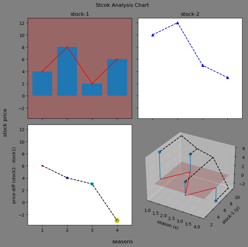
这里用到的 ax.plot_surface 的具体用法可以先不用关系,看懂其他的就可以了。
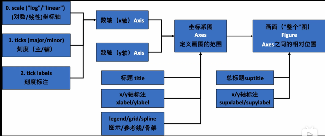
# 2.4 更多 Figure 布局
刚刚使用的 plt.subplots 只是一个基本的布局,如果需要使用一个更加精确、更加不规律的布局的话,可以使用 gridspec 来进行布局,gridspec 通过定义网格控制坐标系位置,通常采用如下四个语法来进行画图:
- fig = plt.figure():初始化,返回一个 Figure 画面,还需要继续去添加坐标系
- ax = plt.subplot():初始化,并且添加一个 Axes 并返回了它
- fig, ax = plt.subplots(m, n):初始化,并且添加 m 行 n 列个 Axes
- ax = fig.add_subplot():添加一个 Axes
plt.figure 常用参数
plt.figure(参数…)
- figsize=(6, 6):6 英寸 × 6 英寸的图像
- dpi=300:每英寸 300 个点像素,默认是 100,现在常改为 300
- sharex / sharey = True/False:坐标系共享相同的 x/y 显示范围
- facecolor=‘white’:Figure 背景设置为白色,否则为透明
- edgecolor=‘white’:Figure 背景边缘设置为白色,否则为透明
plt.subplots 常用参数
plt.subplots(参数…)
- gridspec_kw=‘height_ratios’: [2, 2, 1, 1] 传入网格参数
- subplot_kw=‘projection’: ‘polor’ 传入 add_subplot 函数中的参数,这里改变为极坐标
# 3. 工作基本流程
这里主要讲一下你的工作基本流程。
# 3.1 导入包,设置风格
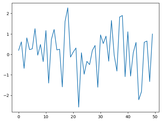
# 3.1.1 style: default
#### step 1. 导入包 ####
import matplotlib.pyplot as plt
import matplotlib as mpl

#### step 2. 设置画图风格 ####
plt.style.use('default')
plt.plot(np.random.randn(50))
plt.show()
1
2
3
4
5
6
7
8
2
3
4
5
6
7
8
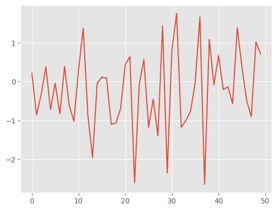
# 3.1.2 style: R 画图风格
plt.style.use('ggplot')
plt.plot(np.random.randn(50))
plt.show()
1
2
3
2
3
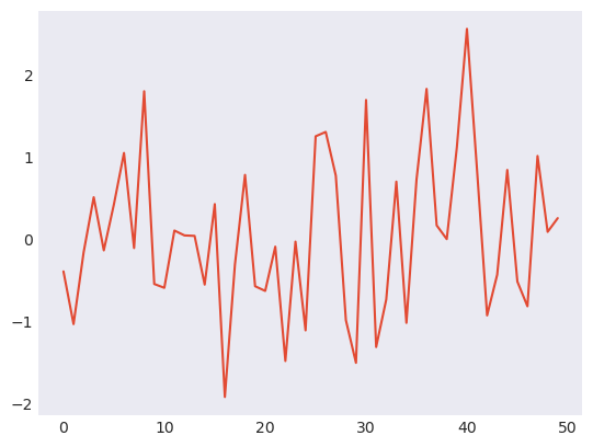
# 3.1.3 style: seaborn-dark
plt.style.use('seaborn-dark')
plt.plot(np.random.randn(50))
plt.show()
1
2
3
2
3
# 3.2 改变全局默认设置
这里需要设置一些常用的全局配置参数。
# 设置支持中文字体(黑体)
mpl.rcParams['font.family'] = ['Heiti SC']
# 设置 dpi,提高图片清晰度
# 这样设置后就不需要以后每次生产 Figure 都去重新设置
mpl.rcParams['figure.dpi'] = 300

# 默认大小尺寸 [6.4 inch, 4.8 inch]
# 1 inch = 2.54 cm
plt.rcParams.get('figure.figsize')
# 默认字体大小:10.0
# 这个字体大小其实与 Word 中的字体大小是一个意思
plt.rcParams.get('font.size')

# 图画面板调整为白色
rc = {
    'axes.facecolor': 'white',
    'savefig.facecolor': 'white'
}
mpl.rcParams.update(rc) # 一次更新多个值
# 打印数学公式
mpl.rcParams['text.usetex'] = True
# Figure 自动调整格式
plt.rcParams['figure.constrained_layout.use'] = True
1
2
3
4
5
6
7
8
9
10
11
12
13
14
15
16
17
18
19
20
21
22
23
2
3
4
5
6
7
8
9
10
11
12
13
14
15
16
17
18
19
20
21
22
23
查询当前你的计算机中matplotlib的可用字体
# 例子:查询当前你的计算机中matplotlib的可用字体
import matplotlib.font_manager as fm

fm._load_fontmanager(try_read_cache=False)
fpaths = fm.findSystemFonts(fontpaths=None)
# print(fpaths)
exempt_lst = ["NISC18030.ttf", "Emoji"]
skip=False
for i in fpaths:
    # print(i)
    for ft in exempt_lst:
        if ft in i:
            skip=True
    if skip==True:
        skip=False
        continue
    f = matplotlib.font_manager.get_font(i)
    print(f.family_name)
1
2
3
4
5
6
7
8
9
10
11
12
13
14
15
16
17
18
2
3
4
5
6
7
8
9
10
11
12
13
14
15
16
17
18
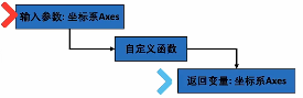
# 3.3 画图代码复用
我们往往会写一个画图函数来方便之后复用,一个示例如下:
# 三个“三角函数”
x = np.linspace(0, 10, 100)
y1 = np.cos(x)
y2 = np.sin(x)
y3 = np.tanh(x) # tanh函数

# 画时间序列曲线
# 输入/输出都包含坐标轴变量
def plot_time_series(x, y, fmt, lab="", ax=None):
    if ax is None:
        fig, ax = plt.subplot()
    ax.plot(x, y, fmt, label=lab)
    # x轴固有格式
    ax.set_xlabel("time")
    ax.xaxis.set_major_locator(plt.MultipleLocator(np.pi / 2))
    ax.xaxis.set_minor_locator(plt.MultipleLocator(np.pi / 4))
    labs = ax.xaxis.get_ticklabels()
    ax.xaxis.set_ticklabels([r"{:.2f}$\pi$".format(i/2) for i, l in enumerate(labs)])
    return ax

# 两个坐标周
fig, axes = plt.subplots(2, 1, figsize=(6, 3),
                         sharex=True, facecolor="white")
# 在第一个坐标周画两条线
plot_time_series(x, y1, 'b-', r'$y=sin(x)$', ax=axes[0])
plot_time_series(x, y2, 'r:', r'$y=cos(x)$', ax=axes[0])
# 在第二个坐标周画一条线
plot_time_series(x, y3, 'g--', ax=axes[1])

plt.show()
1
2
3
4
5
6
7
8
9
10
11
12
13
14
15
16
17
18
19
20
21
22
23
24
25
26
27
28
29
30
2
3
4
5
6
7
8
9
10
11
12
13
14
15
16
17
18
19
20
21
22
23
24
25
26
27
28
29
30
- 这个需要复用的函数往往设计成:需要传入 ax,然后函数再返回 ax,而具体的 ax 实例对象是在外部生成的,这个函数只专心于对给定的 ax 绘图。
# 4. More
# 4.1 Jupyter notebook 中的模式
- %matplotlib inline:返回静态图像
- %matplotlib widget:安装 ipympl 包 <- JupyterLab
- %matplotlib notebook <- Jupyter Notebook
- %matplotlib qt:如果安装了 qt
一般设定模式后不要反复切换。
# 4.2 后端/资源管理
# 内存/显示处理
plt.show()  # 显示当前 figure 对象
plt.close() # 关闭当前 figure 对象
plt.get_fignums()   # 查询当前的所有图像编号
1
2
3
4
2
3
4
# 删除元素(用于尽快清理内存)
plt.clf()   # clear current figure
plt.cla()   # clear current axes
plt.close('all')    # close all figure windows
1
2
3
4
2
3
4
# 4.3 自学
- https://matplotlib.org/stable/gallery/index.html (opens new window)
- 根据类型搜索
- 根据语法搜索
- https://www.python-graph-gallery.com/ (opens new window)
- 更全面图片分类
- 收集了网络中很多精美的画图 + 源代码
- https://r-graph-gallery.com/ (opens new window)
- https://d3-graph-gallery.com/ (opens new window)
- 非编程(非自动化)画图:如:PPT;Adobe Illustrator;
编辑 (opens new window)
上次更新: 2022/12/25, 15:53:12